
2024Activity reportProject-TeamAVIZ
RNSR: 200818367J- Research center Inria Saclay Centre at Université Paris-Saclay
- In partnership with:Université Paris-Saclay
- Team name: Analysis and VIsualiZation
- In collaboration with:Laboratoire Interdisciplinaire des Sciences du Numérique
- Domain:Perception, Cognition and Interaction
- Theme:Interaction and visualization
Keywords
Computer Science and Digital Science
- A2.1.10. Domain-specific languages
- A3.1.4. Uncertain data
- A3.1.7. Open data
- A3.1.8. Big data (production, storage, transfer)
- A3.3. Data and knowledge analysis
- A3.3.1. On-line analytical processing
- A3.3.3. Big data analysis
- A3.5.1. Analysis of large graphs
- A5.1. Human-Computer Interaction
- A5.1.1. Engineering of interactive systems
- A5.1.2. Evaluation of interactive systems
- A5.1.6. Tangible interfaces
- A5.1.8. 3D User Interfaces
- A5.1.9. User and perceptual studies
- A5.2. Data visualization
- A5.6.1. Virtual reality
- A5.6.2. Augmented reality
- A6.3.3. Data processing
- A9.6. Decision support
Other Research Topics and Application Domains
- B1. Life sciences
- B1.1. Biology
- B1.2. Neuroscience and cognitive science
- B9.5.6. Data science
- B9.6. Humanities
- B9.6.1. Psychology
- B9.6.3. Economy, Finance
- B9.6.6. Archeology, History
- B9.6.10. Digital humanities
1 Team members, visitors, external collaborators
Research Scientists
- Jean Daniel Fekete [Team leader, INRIA, Senior Researcher, HDR]
- Petra Isenberg [INRIA, Senior Researcher, HDR]
- Tobias Isenberg [INRIA, Senior Researcher, HDR]
Faculty Members
- Florent Cabric [Univ Paris Saclay, Associate Professor, from Sep 2024]
- Frederic Vernier [Univ Paris Saclay, Associate Professor]
Post-Doctoral Fellows
- Ambre Assor [INRIA, Post-Doctoral Fellow, from Apr 2024]
- Florent Cabric [INRIA, Post-Doctoral Fellow, until Aug 2024]
- Sungbok Shin [INRIA, Post-Doctoral Fellow, from Sep 2024]
- Lijie Yao [INRIA, Post-Doctoral Fellow, until Mar 2024]
PhD Students
- Aikaterini Batziakoudi [Berger-Levrault, CIFRE]
- Anne-Flore Cabouat [Univ Paris Saclay, from Oct 2024]
- Tingying He [Univ Paris Saclay, until Sep 2024]
- Yucheng Lu [Univ Paris Saclay]
Technical Staff
- Ludovic David [INRIA, Engineer]
- Olivier Gladin [INRIA, Engineer]
- Hande Gozukan [INRIA, Engineer]
- Christian Poli [INRIA, Engineer]
Interns and Apprentices
- Anne-Flore Cabouat [Univ Paris Saclay, Intern, until Mar 2024]
- Zihan Lu [INRIA, Intern, from Mar 2024 until Sep 2024]
Administrative Assistant
- Katia Evrat [INRIA]
Visiting Scientists
- Narges Mahyar [Univ Massachusetts Amherst, from Nov 2024]
- Emanuele Marques Rodrigues Santos [Univ Federal Do Ceara (UFC), from Feb 2024]
- Filip Opálený [Univ Masaryk, from Nov 2024]
- Tobias Rau [Univ Stuttgart, from Sep 2024]
- Junxiu Tang [Univ Zhejiang, until Jun 2024]
- Karelia Alexandra Vilca Salinas [Univ Sao Paulo, until Jan 2024]
- Lu Ying [Univ Zhejiang, from Feb 2024 until Sep 2024]
- Eliane Zambon Victorelli [Univ Sao Paolo, from May 2024 until Oct 2024]
External Collaborators
- Anne-Flore Cabouat [Univ Paris Saclay, from Apr 2024 until Sep 2024]
- Zihan Lu [n/a, from Oct 2024]
- Gabriela Carolina Molina Leon [Univ Bremen]
- Alexis Pister [Univ Edinburgh, until Nov 2024]
- Lu Ying [Univ Zhejiang, from Nov 2024]
- Eliane Zambon Victorelli [Univ Sao Paulo, from Nov 2024]
2 Overall objectives
2.1 Objectives
Aviz (Analysis and VIsualiZation) is a multidisciplinary project that seeks to improve data exploration methods, techniques, and tools based on Interactive Visualization. Visualization, in general, refers to the graphical representation of data or concepts to aid access, distribution or explanations of data. Card et al. give a general definition for visualization as
“the use of computer-supported, interactive, visual representations of data to amplify cognition.” 54
Taking this definition, visualization is a means of creating visual aids that lead to insight in the underlying data sets. It is not about producing nice pictures but about making data understandable and explorable so that visualizations help viewers gain knowledge about the data. It is about aiding the process of forming a mental model for the acquired data and so helping the viewer to understand underlying concepts, patterns, and connections within the data 77. In partiular, visualization has the goal to improve humans' sensemaking of complex data by taking advantage of the capabilities of their vision system: visual information can be processed in parallel and with a high bandwidth into the human cognitive centers 85. Ware defines five advantages of visualization 85:
- Comprehension: Supports the comprehension of large amounts of data.
- Pattern Perception: Previously unnoticed properties of data may emerge.
- Problem Analysis: Problems within the data may become immediately apparent.
- Adaptability: facilitates understanding of large- and small-scale features of data.
- Interpretation: Hypothesis formulation is facilitated.
Three main areas of visualization have evolved in the computer science community: Scientific Visualization, Information Visualization, and Visual Analytics. Scientific visualization is primarily concerned with displaying real or simulated scientific data. Basic visualization techniques for this area include surface rendering, volume rendering, and animation. Typical examples include processing of satellite photographs, fluid flows, or medical data. Datasets in information visualization typically come from large information spaces or information systems and are both structured or unstructured. Examples include network data, multi-dimensional tables of abstract measurements, or unstructured data such as text. Visual analytics, finally, is concerned with augmenting human-led data exploration with automatic techniques such as machine learning. The Aviz team has expertise in all three areas of visualization.
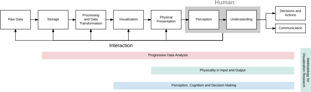
The conceptual Data Analysis Pipeline related to four of the themes of AVIZ.
As shown in Figure 1, visualization deals with the data analysis pipeline and research in visualization has been addressing all the stages with less emphasis on the two initial ones and the last one. In its initial incarnation, Aviz has been focusing on interaction in combination with visualization, physical presentation, and perception. We now want to expand our research to wider questions, both in the human-side and in the system side. For the human side, we want to better understand human perception and cognition to improve the visualization techniques, so as to better convey information to the human brain. We also want to better understand the human biases to overcome them when possible, or provide methods to avoid them otherwise.
On the system side, we want to expand the scope of visualization that is currently limited to relatively small datasets and relatively simple analytical methods. To achieve scalability in visualization, we will focus on a paradigm shift: progressive data analysis. Long-running computations currently hamper the exploration and visualization process because human's attention is limited by latency constraints. We want to design exploratory systems that provide continuous feedback and allow interactions at any time during computation. The new progressive data analysis paradigm offers these capabilities, but to be usable, it requires the whole analytical pipeline to be re-implemented, and visualization and interaction techniques to be adapted.
2.2 Research Themes
Aviz's research on Visualization and Visual Analytics is organized around five research themes, described in more detail in the next section. Instead of addressing point problems, each research theme will address several stages of the visualization pipeline in a holistic manner, as summarized in fig:diagram.
1. Progressive Data Analysis and Scalability will address visualization scalability problems. Existing data analysis systems (such as Tableau 78, R 79, or Python with its data analysis ecosystem 64) are not scalable for exploratory analysis because their latency is not controllable. This theme will lay out the foundations of progressive data analysis systems, which generate estimates of the results and updates the analyst continuously at a bounded pace. It will focus on all the stages of the data analysis pipeline: data management mechanisms, data analysis modules, as well as visualizations, perception, understanding, and decision making 2.
2. Physicality in Input and Output will seek to better understand the benefits of physicality for information. Although beyond-desktop environments for visualization are generating more and more interest, theories and empirical data are lacking. This theme will consolidate the nascent areas of data physicalization, situated visualization, and immersive visualization.
3. Perception, Cognition, and Decision Making will study how we perceive and understand visualizations in order to develop generalized guidelines for optimizing effectiveness. It will generalize results obtained with simple charts to more complex visualizations of large datasets, establish theories on the use of abstraction in visualization, and contribute new empirical knowledge on decision making with visualizations.
4. Methodologies for Visualization Research will develop new methods to ground the study of the above scientific questions, and to benefit visualization more generally. This theme will develop evidence-based strategies for communicating quantitative empirical findings, and will promote methodological discussions and open research practices within the field.
5. Visualization Techniques. This research direction is more general than the ones above. We study several dedicated visualization approaches that intersect with our major goals above but adress more generic issues related to creative visualizations and interactions in general.
3 Research program
3.1 Research Axis 1: Progressive Data Analysis and Scalability
Permanent involved: Jean-Daniel Fekete
Scalability is a major issue in visualization, although the problem has never been well defined until recently 5 and has received less attention in visualization than in other data-science related domains.
While data analysis has made tremendous progress in scalability in the last decade, this progress has only benefited “confirmatory” analysis or model-based computation; progress in data exploration has lagged behind. Existing data analysis systems do not support data exploration at scale because, for large amounts of data or for expensive computations, their latency is not controllable: computations can take minutes, hours, even days and months. Cognitive psychologists have shown that humans' cognitive capabilities degrade when latency increases 71, 76. Miller 71 points out that the feedback of a system should remain below 10 seconds to maintain the user's attention. Therefore, to try to limit the latency, analysts currently resort to complex, inefficient, and unsatisfactory strategies, such as sampling with its issues related to representativity.
To address the scalability problem under controlled latency, instead of performing each computation in one long step that forces the analyst to wait for an unbounded amount of time, a progressive system generates estimates of the results and updates the analyst continuously at a bounded pace. The process continues until the computation is complete, or it stops early if the analyst considers that the quality of the estimates is sufficient to make a decision. During the process, a progressive system allows users to monitor the computation with visualizations and steer it with interactions.
While the topic of progressive data analysis has started to emerge in the late 90's, it has remained marginal practically because it touches three fields of computer science that are traditionally separate: data management, data analysis, and visualization. Research on progressive data analysis remains fragmented; the solutions proposed are partial and the different solutions cannot always be combined. We have organized a Dagstuhl seminar on Progressive Data Analysis and Visualization 55, 80 that acknowledged the harm of this topical separation and devised a research agenda. Aviz will participate in this agenda with specific assets and published a book about the topic 2.
Aviz is actively working on designing and implementing the ProgressiVis language that is natively progressive 56. The language relies on a Python interpreter but its execution semantics is different in the sense that all the operations that would take time to execute are performed progressively. The ProgressiVis system touches all the stages of the conceptual data analysis pipeline of fig:diagram; it integrates data management mechanisms, data analysis modules, as well as visualizations, perception, understanding, and decision making. Aviz will strengthen its work on the implementation of a natively progressive data science system. Such a system will lead to the following research topics:
- Progressive language kernel and data management mechanisms
- Progressive algorithms and computation strategies
- Progressive visualizations
- Management of uncertainties, computed from the algorithms and conveyed to the analysts.
Language:
ProgressiVis relies on a Python interpreter that is convenient for quick prototyping. We are using many internal mechanisms of the Python language to create a toolkit that allows programming progressive applications in a convenient way.
Algorithms:
Existing libraries implementing algorithms are either “eager”, sometimes “online”, and more rarely “streaming”, but very few are compatible with our progressive paradigm. We already designed several progressive algorithms and want to further expand the range of algorithms we can support, and better understand how algorithms could be transformed into their progressive counterpart.
Progressive computation can trade speed, memory, and quality. When analysts want to compute rough estimates of their results quickly, several progressive algorithms offer parameters to control the tradeoffs. For example, our progressive k-nearest-neighbors algorithm 62 allows choosing the number of k-d-trees that influences the memory footprint, accuracy, and speed. Progressive data analysis also uses and adapts streaming algorithms, also called “data sketches” 57, that offer various tradeoffs between speed, memory, and quality.
Visualizations:
Like algorithms need to be adapted or transformed, visualization techniques and user interfaces also need to be adapted to be used in a progressive setting.
For the visualization pipeline, including the rendering phase, there has been previous work related to progressive layout computation and progressive rendering. For example, in network visualization, there is an old tradition of using iterative force-directed solvers and showing their results progressively when computing complex graph layouts. We generalize this approach to all the visualizations. Progressive rendering is popular in the real-time computer graphics and gaming domains, but new in visualization. We are designing visualization techniques based on GPU and accelerated algorithms to better render aggregated visualizations, such as heatmaps and sampled visualizations.
We have also started to explore the problem of requirements for progressive user interfaces 51, leading the community of researchers to understand that progressive systems need to provide effective assessments of the quality of their results to allow analysts to make early decisions. This justifies the next research topic on the management of uncertainties. We have also started to propose new data models for managing aggregated visualizations 63. We now continue our research to adapt existing visualization techniques and interactive environments to deal with progressive results and parameter steering.
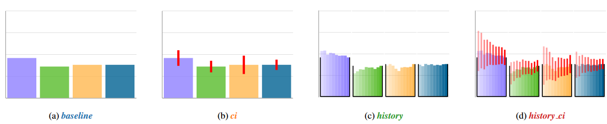
(1) simple bar char. (2) with confidence intervals. (3) with recent history, and (4) with recent history and confidence intervals.
Management of uncertainties:
When performing exploratory data analysis on large data, analysts start by trying some algorithms with different parameters until they obtain useful results. Therefore, it is of paramount importance to be able to realize that a specific algorithm or a specific set of parameters is not leading to a useful result and to abort an analysis before it ends to explore other methods. On the other side, in many circumstances when data is “well-behaved”, progressive algorithms achieve very good results quickly, and analysts can make a decision before the end of the algorithms' execution. The assessment of a quality measure related to a computed result is a complex problem, already tackled by other communities (e.g., streaming, approximate queries).
Progressive Data Analysis adds two problems: (1) controlling uncertainty during progressive computations, and (2) conveying the results of this uncertainty in a way understandable by analysts, while avoiding possible cognitive biases such as priming and anchoring 65.
To control the uncertainty during the progression of a computation, methods related to Sequential Analysis 59 should be used. They are well-known in the area of clinical trials and have evolved recently to manage large amounts of data while controlling time or quality in Approximate Query Databases such as BlinkDB 50.
We have already shown that humans are quite good at deciding when to stop a progressive process to make an early decision using progressive bar charts 72 (fig:ExamplesOfProgressiveBarChartsWeStudied); humans are cognitively equipped to make sense of progressive processes. Additionally, visualization can help humans make sense of and interact with progressive processes, such as our new-history bar chart designs that help to render visually when a progressive process starts to converge, opening a new line of research to discover the possible forms of support.
3.2 Research Axis 2: Physicality in Input and Output
Permanents involved: Petra Isenberg, Tobias Isenberg, Jean-Daniel Fekete
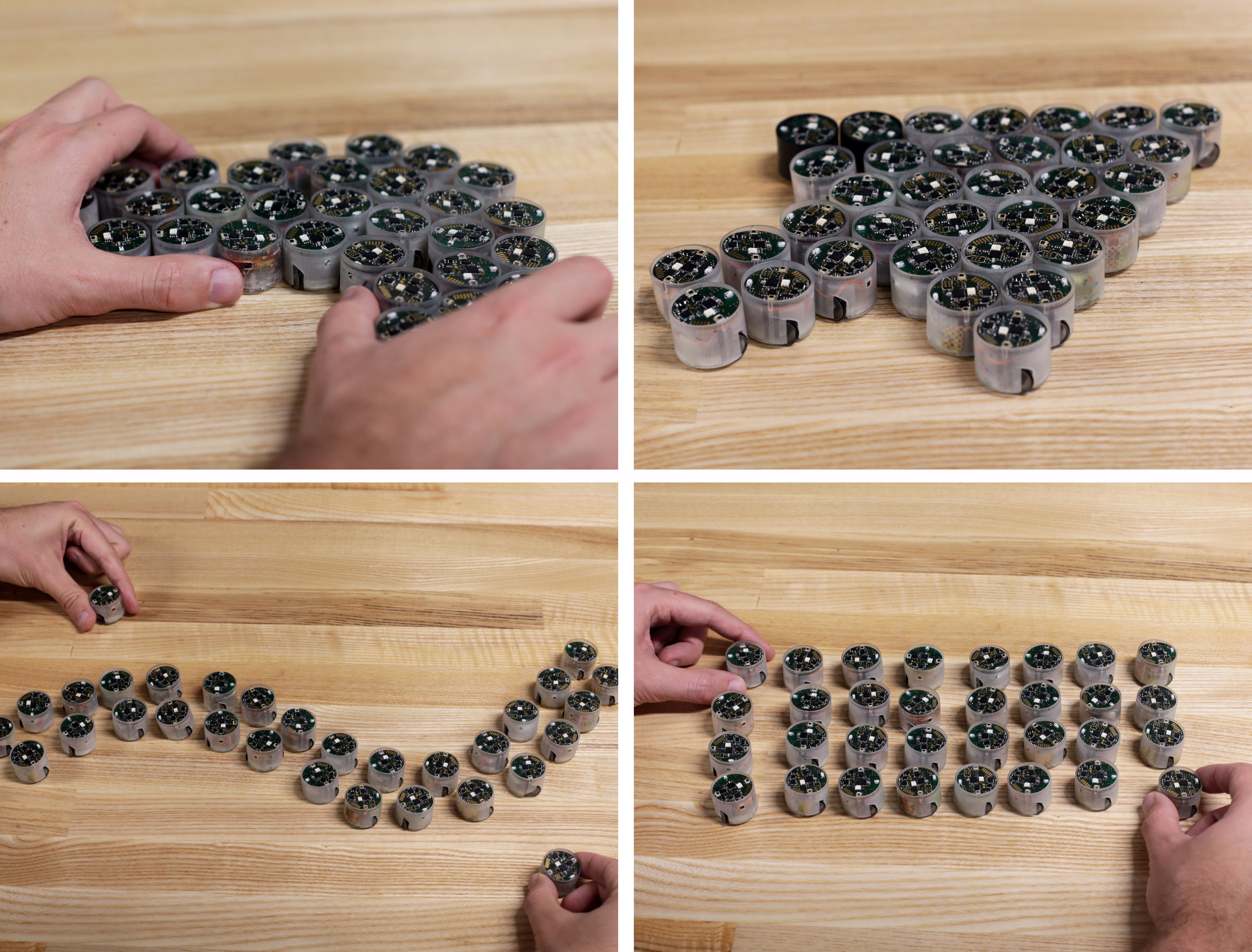
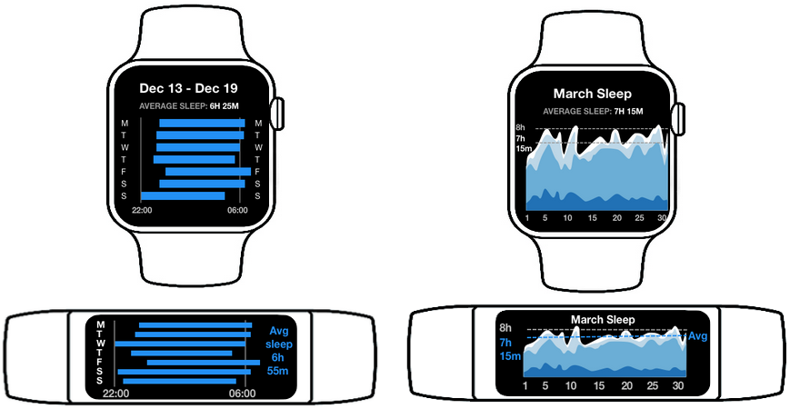
This is a compilation of images showing work the Aviz team did in the area of "physicality in input and output". The first image shows the Zooids project about miniature robots that can produce data physicalizations. The second shows a visualization for a smartwatch and fitness band about sleep data. The third shows situated visualizations in a video game. The third shows a visualization in augmented reality and a selection technique for choosing certain points.
During the last five years, we expanded our work on beyond-desktop environments for visualization. Our team has made contributions in the areas of data physicalization, visualization for wearable devices, situated and embedded visualization, and visualization in augmented reality.
Data Physicalization: Data physicalization is a rich and vast research area that studies the use of physical artifacts to convey data. It overlaps with a number of research areas including information/scientific visualization, visual analytics, tangible user interfaces, shape-changing interfaces, fabrication, as well as graphic design, architecture, and art. Physical data visualizations tap into our lifelong experience of perceiving and manipulating the physical world, either alone or with other people. Among the earliest man-made artifacts are physical representations of semantic concepts that provide physical metaphors that allow us to reason, remember, and communicate. With the advent of computers, we have substituted physical representations with pixels on a computer screen. The resurgence of physicalization as a research area, following our early definitions 61, asks what we have lost in this transformation. Certainly, a computer-based visualization allows us to zoom an image, transform variables in real time, and to zoom through virtual computer-based world. However, these representations can sever the relationship to the natural world, depriving us of the touch, feel, and emotion that comes from interacting with real objects. We studied several aspects of data physicalization including technical challenges of constructing physicalizations, potential benefits, and how historical examples could transfer to a modern world.
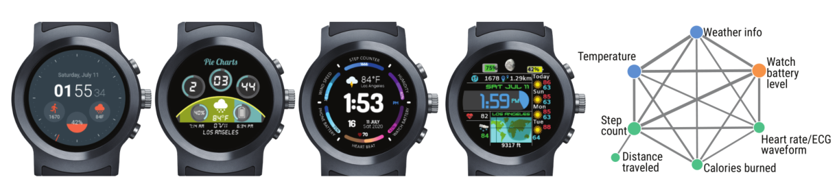
Visualization for Wearable and Mobile Devices: In the area of wearable and mobile-devices we engaged in device-driven research where we considered how small device form factors may influence how we need to design visualizations and how we can use them. Portable and wearable personal devices such as fitness tracking armbands, hand-held GPS trackers, smart watches, or mobile phones are very small displays that are capable of producing data themselves (through sensors), downloading it from other sources (through Wifi or Bluetooth), and displaying it immediately 67. Often the data is shown in the form of visualizations that have to be adapted to the small display size. We consider very small visualizations that are often used on such devices under the term “micro visualization” and have been working towards a better understanding of the complexities involved in designing and using micro visualizations but also studied the influence of the unique context of use of mobile devices on visualization use and design.
Situated and Embedded Data Representations: We study how embedding data visualizations in the context of the data sources can empower people to make effective use of their data in a variety of application contexts. Our goal in this work is to go beyond the traditional platforms of data analytics by using situated data visualizations on various types of non-traditional displays. In a situated data visualization, the data is directly visualized near the physical space, object, or person it originates from 86. For example, a person may attach small e-ink displays embedded with sensors at various locations of their house or their workplace, to better understand their use of space, of equipment, or of energy resources. Or a person who wishes to exercise more may use an augmented reality device to visualize their past running performance in-place. New situated data visualizations like these can surface information in the environment—allowing viewers to interpret data in-context and take action in response to it 87.
Visualization using Augmented Reality Devices: Many datasets are 3D-spatial in nature and researchers and practitioners could benefit from seeing them in true 3D space. This is where immersive technologies shine, and the recent advances in VR and AR headset technologies have made such displays accessible to the general public—the lack of large dedicated VR installations such as a CAVE is not preventing the use of immersive rendering anymore. Nonetheless, the investigation of 3D datasets also frequently requires researchers to use tools such as scripted analysis and statistical evaluation, and such direction of investigation will continue to be a cornerstone of scientific work. In our investigations we are thus interested in looking at, in particular, hybrid setups that allow researchers to use the best of both worlds: traditional workstations combined with an AR overlay for stereoscopic rendering of 3D data 84.
3.3 Research Axis 3: Perception, Cognition and Decision-Making
Permanents involved: Petra Isenberg, Tobias Isenberg, Jean-Daniel Fekete, Florent Cabric
As we collect increasingly large amounts of data in fields such as climate science, finance, and medicine, the need to understand and communicate that data becomes more important. Data visualizations are often used to give an overview of information, however it can be challenging to predict whether these visualizations will be effective before spending resources to develop them. Consequently, researchers make use of experimental methods from visual perception and cognition to study how we perceive and understand visualizations in order to develop generalized guidelines for optimizing effectiveness. On this research axis we have three focus areas:
Perception of Visualizations in Novel Contexts. Novel technology and usage contexts have several characteristics for data visualizations that warrant a (re-)evaluation of how well people can perceive visualizations. Characteristics we were particularly interested in include:
- Physical factors: Many now common displays have characteristics that warrant (re-)evaluation of what we know about visualizations to be displayed on them. Small form factors of displays such as smartwatches and fitness bands are an obvious characteristic. Some screens deviate from the standard rectangular form we are familiar with and use a circular geometry, which is another interesting design constraint for visualization.
- Data display mobility: Data display mobility captures the movement of the display(s) containing visual representations of data. Fixed, movable, carryable, wearable, and independently moving displays can be differentiated along this dimension. We conducted some of our research on carryable devices, including mobile devices such as smartphones and tablets but also wearable displays such as smartwatches and head-mounted displays.
- Context-of-use: Many novel displays are used in contexts that are much unlike traditional office settings. Visualizations here may be subjected to different lighting conditions and viewers may only afford very quick glances at the displays themselves. For example, when in a car the driver can only afford very quick glances at the GPS before returning to the primary task of arriving safely.
Within this focus area we worked on some of these aspects; such as the need for quick glances, the display size of visualizations, the movement of viewers or the data, and the understanding of 3D augmented reality spaces. We relied mostly on mixed-methods user studies where a quantitative analysis methodology was coupled with interviews or questionnaires.
Illustrative Visualization. This focus area takes inspiration from illustrators' decades to centuries of experience on perception and cognition to better portray scientific subject matter. Another input arises from the field of non-photorealistic rendering which has developed numerous techniques of stylizing images and other input data. Traditionally, illustrative visualization has thus been applied primarily to data with a concrete spatial mapping in 2D and, more frequently, in 3D space.
Another main direction of research in this context is what the role of abstraction is in illustrative visualization 83, 82 as well as visualization in general, and specifically how we can provide dedicated means to control the abstraction being applied to visual representations of data. This means that we need to go beyond seeing abstraction only as a side-product of stylization as it has traditionally been viewed in many approaches in non-photorealistic rendering as well as illustrative visualization to date, and investigate how we can interactively adjust it to provide practitioners with a means to find the best visual representations for a given task. For example, we have investigated this question in the context of structural biology 89 and DNA nanostructures 68, 69, 70, but also want to expand this work to other application domains in the future.
Decision-Making with Visualizations. Human decision-making and cognitive biases are important research topics in the fields of psychology, economics and marketing. Visualization systems are increasingly used to support decision-making: large companies switch to visualization solutions to improve their decisions in a range of areas, where large sums of money or human lives are at stake. More and more, the ultimate goal of visualization is not to understand patterns in the data and get insights as was traditionally assumed, but to make good decisions. In order to fully understand how information visualizations can support decision-making, it is important to go beyond traditional evaluations based on data understanding, and study how visualizations interact with human judgment, human heuristics, and cognitive biases.
We pursue this important stream of research by investigating decision-making in the presence of uncertainty and incomplete information (in connection with the topics discussed in sec:progressive and the use of visualizations to support social choice and group decisions in the presence of conflicts of interest. How cognitive biases interact with visual perception is also an important and difficult question that has remained largely unexplored.
3.4 Research Axis 4: Methodology for Visualization Research
Permanents involved: Petra Isenberg, Tobias Isenberg, Jean-Daniel Fekete
An important aspect of any scientific research is to establish and follow rigorous and effective methodologies for acquiring new knowledge. In the field of Visualization in particular, scientific discourse on the validity, use, and establishment of methodologies is important as the field is highly interdisciplinary, with diverse influences and opinions. It is important to establish, for example, what level of rigor the field should require of its methods, how to choose among established methods and methodologies, and how to best communicate the results of our empirical research. We focus our efforts on three main topics related to visualization research methodologies.
Promoting and Following Open Research Practices
For issues with open research practices to be addressed, educational materials and guidelines need to be written, so researchers have clarity about how to make their research more credible. Aviz members are working with the organizing bodies of the visualization research community to establish incentives for making research artifacts and potentially establish minimal requirements for openness in published articles. Meanwhile, it is important to continue measuring and cataloging openness in the field to monitor progress. The goal is to improve the credibility and applicability of the field’s research.
Shaping the Scientific Visualization Community Aviz researchers are heavily involved in the organization structure of IEEE visualization conferences, the most prestigious conference in our field, by proposing workshops, tutorials, serving on various organizing committees, steering committees, editorial boards. We, in particular, aid the process by providing data collection and analysis services through the vispubdata.org dataset that we are collecting, cleaning, and making available to the community. The dataset has already been used in research (e. g., 66) but also to shape the scientific community by proposing program committee members, new processes, and was used by the Visualization Restructuring Committee (ReVISe). We are also involved in the EuroVis community and participate at multiple levels to its organization and management.
3.5 Research Axis 5: Visualization Techniques
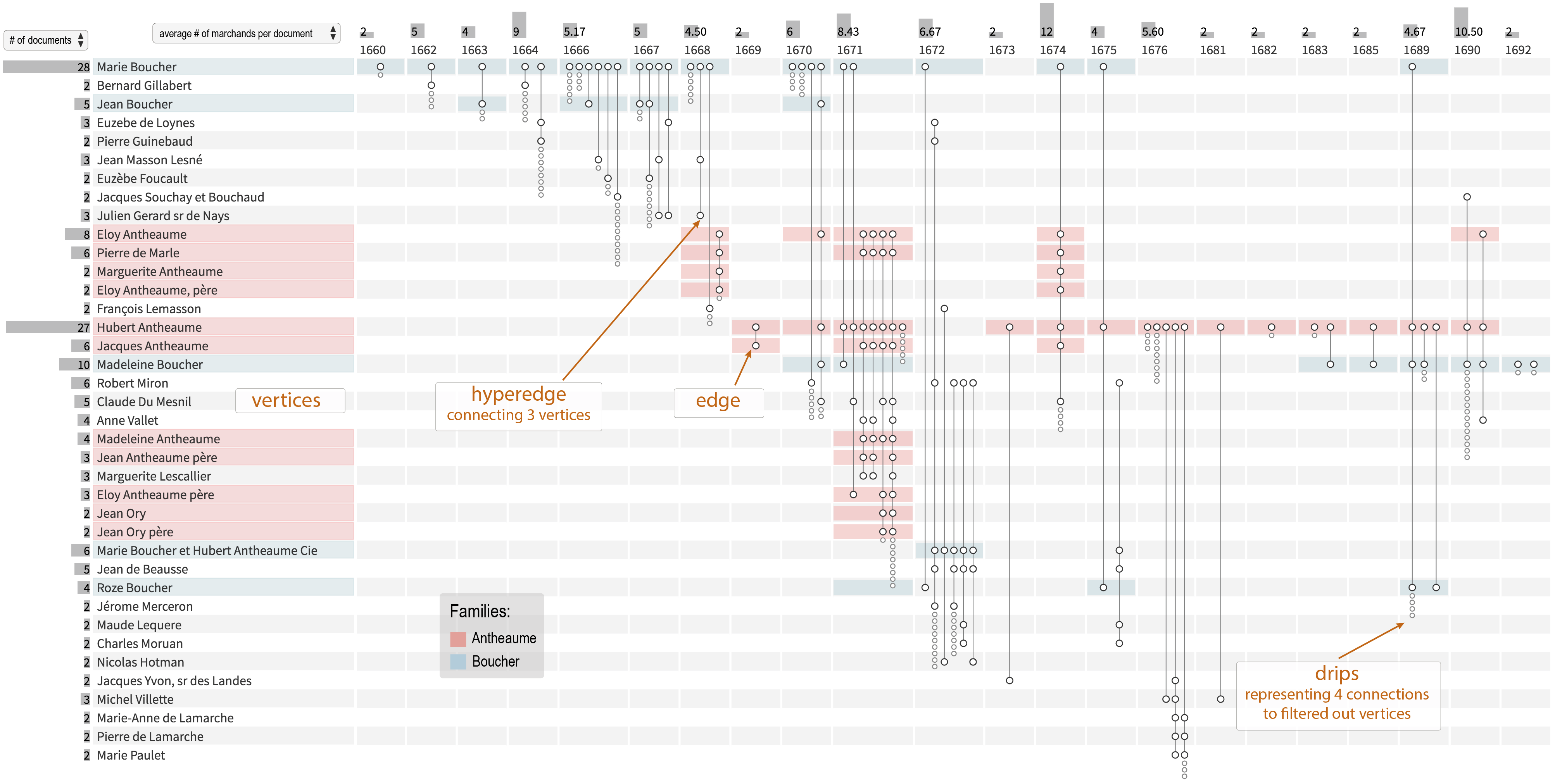
This image represents a new type of visualization to visualize dynamic hypergraphs.
We study several dedicated visualization approaches that intersect with our major goals above. One such set of approaches, particularly needed at the intersection of AR and VR, are those that fundamentally require both 3D and 2D representations: how to combine 3D representations with 2D representations, how both are linked with each other (initial work: 74), and how we need to design the interaction to most effectively and efficiently solve practical problems. The visualization field will benefit from a more fundamental and generalizable understanding of such hybrid 3D/2D environments. The individual research into the specific directions will provide a part of this understanding, but we also plan to arrive at a more theoretical understanding of this space. For this purpose we plan to formulate the properties of the respective components and their respective limitations and boundaries, how the individual components affect each other, and how the existing hybrid settings overcome the limitations and boundaries at the moment. Next, we aim to derive an interaction language to describe the current situation, to then be able to generalize the concepts to be able to inform the design of future interactive visualization systems.
We have also started to explore techniques to visualize dynamic hypergraphs 81 (see fig:ExamplesOfVisualizationTechniques) and their clustering 73. These dynamic hypergraphs are very effective at representing, e.g., people mentioned in documents across time, such as publications, contracts, personal records, etc. This new line of research is stirring interest in the visualization community but also in very different communities, such as social history, cybersecurity, health monitoring for bridges, and linguistics. We are now continuing to improve the visualization technique to better scale, and to support aggregation using interactive and automated techniques. Our technique for clustering social networks (social hypergraphs) based on ensemble clustering 73 is also applicable to other structures (simple graphs and tabular data). We want to generalize it and scale it to larger ensembles.
4 Application domains
4.1 Natural Sciences
We often deal with data that is inherently three-dimensional in nature, for example, from fields such as biology, astronomy, or medicine. We work with experts from the respective natural sciences to create, for example, illustrative visualizations of scientific data, such as a continuous zooming technique from the nucleus of a cell all the way down to the atom configuration of the DNA, for example, for the application in education. Also our work with immersive technology is often applied to application cases from the natural sciences.
4.2 Social Sciences
We collaborate with social science researchers from EHESS Paris on the visualization of dynamic networks; they use our systems (GeneaQuilts 52, Vistorian 75, PAOHVis 81, PK-Clustering 73) and teach them to students and researchers. Our tools are used daily by ethnographers and historians to study the evolution of social relations over time. In the social sciences, many datasets are gathered by individual researchers to answer a specific question, and automated analytical methods cannot be applied to these small datasets. Furthermore, the studies are often focused on specific persons or organizations and not always on the modeling or prediction of the behavior of large populations. The tools we design to visualize complex multivariate dynamic networks are unique and suited to typical research questions shared by a large number of researchers. This line of research was supported by the DataIA “HistorIA” project, and by the “IVAN” European project. We currently collaborate with PayAnalytics, an Icelandic company to visualize data to help companies close their gender pay gaps.
4.3 Medicine and Sports
We collaborate with the Health-Data-Hub on the analysis and visualization of French Social Security (CNAM) Data “parcours de santé” to help referent doctors and epidemiologists make sense of French health data. In particular, we are working on a subset of the CNAM Data focused on urinary problems, and we have received very positive feedback from doctors who can see what happens to the patients treated in France vs. what they thought happened through the literature. This project is getting a lot of traction from our partners in medicine, epidemiology, and the economy of health.
We are also collaborating with the “Assistance Publique - Hôpitaux de Paris” AP-HP with a newly funded project called URGE, aimed at improving the emergency services for the Parisian hospitals. See the press announcement.
We collaborate with multiple researchers on projects that apply visualizations to the sports and personal health context. Specifically, we are interested in providing effective visualizations for fitness trackers that are worn during sports activities. We have done extensive research on micro visualizations for smartwatches where we focused on how quickly people can retrieve information from their trackers. In addition, we have been working on embedding situated visualizations in sports videos to aid audiences but also athletes and coaches in associating data with the sports activity itself. The current ANR grant SportsViz will focus on this topic where we will also collaborate with French sports associations through our collaborators at Ecole Central de Lyon.
5 Social and environmental responsibility
5.1 Impact of research results
Aviz' work on illustrative visualization has the potential to be integrated into future teaching materials for students in schools, visitors in museums, or similar.
Aviz' work on visualization of large documents corpora with Cartolabe is used to present the results of the French “Grand débat”, as well as other citizen expressions.
Aviz' work on the gender pay gap aims at improving decision making for closing the adjusted pay gap.
Aviz' work on the visualization of climate change 29, 38 is meant to improve the public understanding of the information gathered by IPCC.
6 Highlights of the year
6.1 Awards
6.1.1 Paper Awards
Aviz received three honorable mentions:
- Anne-Flore Cabouat, Tingying He, Petra Isenberg and Tobias Isenberg. “PREVis: Perceived readability evaluation for visualizations.” 8
- Gabriela Molina Leon, Anastasia Bezerianos , Olivier Gladin and Petra Isenberg. “Talk to the Wall: The Role of Speech Interaction in Collaborative Visual Analytics.’’ 14
- Zack While , Tanja Blascheck , Yujie Gong , Petra Isenberg and Ali Sarvghad . “Glanceable Data Visualizations for Older Adults: Establishing Thresholds and Examining Disparities Between Age Groups.’’ 36
6.1.2 Test Of Time Awards
Aviz received two Test Of Time Awards:
- Mohammad Ghoniem , Jean-Daniel Fekete and Philippe Castagliola . “A Comparison of the Readability of Graphs Using Node-Link and Matrix-Based Representations” 58 received the 20 years Test Of Time Award from IEEE VIS 2024
- Lingyun Yu , Konstantinos Efstathiou , Petra Isenberg and Tobias Isenberg. “Efficient Structure-Aware Selection Techniques for 3D Point Cloud Visualizations with 2DOF Input” 88 received the 12 years Test Of Time Award from IEEE VIS 2024.
6.1.3 Other Awards
Tobias Isenberg received a reviewing honorable mention award at EuroVis 2024.
7 New software, platforms, open data
7.1 New software
7.1.1 ProgressiVis
-
Name:
progressive visualization and data analysis
-
Keywords:
Progressive visualization, Visualization, Visual analytics
-
Functional Description:
Instead of running algorithms to completion one after the other, as done in all existing scientific analysis systems, ProgressiVis modules run in short batches, each batch being only allowed to run for a specific quantum of time - typically 1 second - producing a usable result in the end, and yielding control to the next module. To perform the whole computation, ProgressiVis loops over the modules as many times as necessary to converge to a result that the analyst considers satisfactory.
ProgressiVis relies on well known Python libraries, such as numpy,scipy, Pandas, and Scikit-Learn.
- URL:
-
Contact:
Jean Daniel Fekete
7.1.2 Cartolabe
-
Name:
Cartolabe
-
Keyword:
Information visualization
-
Functional Description:
The goal of Cartolabe is to build a visual map representing the scientific activity of an institution/university/domain from published articles and reports. Using the HAL Database, Cartolabe provides the user with a map of the thematics, authors, and articles. ML techniques are used for dimensionality reduction, cluster, and topic identification, visualization techniques are used for a scalable 2D representation of the results.
Cartolabe has, in particular, been applied to the Grand Debat dataset (3M individual propositions from French Citizen, see https://cartolabe.fr/map/debat). The results were used to test both the scaling capabilities of Cartolabe and its flexibility to non-scientific and non-English corpora. We also added sub-map capabilities to display the result of a year/lab/word filtering as an online generated heatmap with only the filtered points to facilitate the exploration. Cartolabe has also been applied in 2020 to the COVID-19 Kaggle publication dataset (Cartolabe-COVID project) to explore these publications.
- URL:
- Publication:
-
Contact:
Philippe Caillou
-
Participants:
Philippe Caillou, Jean Daniel Fekete, Michèle Sebag, Anne-Catherine Letournel, Hande Gozukan
-
Partners:
LRI - Laboratoire de Recherche en Informatique, CNRS
7.1.3 SwimFlow
-
Name:
Visualization tool for swimming analytics
-
Keywords:
Data visualization, Video analysis
-
Functional Description:
SwimFlow contains a set of basic features for prototyping visualizations in motion coupled with a video.
-
Release Contributions:
Initial entry. This version includes restructured code designed by Ludovic David from the code initially written by Lijie Yao, PhD student in the Aviz team. It restructured the code to make it faster and more easily extensible.
- URL:
-
Contact:
Petra Isenberg
7.1.4 ParcoursVis
-
Name:
Visualization of Patient Pathways
-
Keywords:
Visualization, Health, Progressive visualization
-
Scientific Description:
We developed ParcoursVis, our Progressive Visual Analytics (PVA) tool to explore patients' care pathways at scale. Current tools to visualize temporal event sequences are restricted to datasets as large as a few thousand sequences to remain reactive. With ParcoursVis, we aim to visualize patients' care pathways stored in country-level databases, which can contain order of magnitudes higher of event sequences, at scale using a progressive architecture. PVA tools, instead of waiting for the whole computation to finish before rendering the final results, yield partial results each time the algorithm processes small chunks of data or iterations. This paradigm makes the tool reactive and quickens processes such as checking errors of a query.
-
Functional Description:
ParcoursVis allow extracting a subset of the nationwide database from CNAMTS, transforming the raw data into meaningful medical events, and visualizing it interactively at scale via a web interface.
For the moment, ParcoursVis focuses on non-cancerous prostate adenoma. With this focus, our domain expert users extract meaningful high-level types of events (e.g., treatments and outcomes) that the patients undertake in their care pathways.
Using a progressive visualization method, ParcoursVis visualizes in an aggregated manner the care pathways of tens of millions of patients treated with thousands of events over decades, several orders of magnitude more than existing interactive systems.
- URL:
-
Contact:
Jean Daniel Fekete
7.2 New platforms
7.2.1 Prepare the ProgressiVis Toolkit for a Wider Distribution
Participants: Jean-Daniel Fekete [Inria, Paris-Saclay, correspondent], Christian Poli [Inria], Nivan Ferreira [Univ. Federal de Pernambuco, Brazil].
The ProgressiVis toolkit, implementing a Progressive Data Analysis and Visualization language and environment, has been under heavy development for many years. We have finished its packaging so it can be easily installed by partners who want to experiment with the toolkit and the concept it supports. A documentation is also available (in progress), as well as several graphical and interactive widgets to support its use in modern notebooks.
With the new book on Progressive Data Analysis published 2, we want to push the ProgressiVis toolkit as an advanced proof-of-concept of progressive system architecture.
7.3 Open data
7.3.1 Vispubdata.org
-
Contributors:
Petra Isenberg and Tobias Isenberg
-
Description:
The AVIZ members are making available for research a dataset of IEEE VIS publications at vispubdata.org. This dataset is actively being used for research and conference organization.
- Dataset DOI:
- Project link:
- Publications:
- Contact:
7.3.2 Cartolabe
-
Contributors:
Jean-Daniel Fekete, Hande Gözükan, Philippe Caillou
-
Description:
Along with the Cartolabe system 53, we provide the results of our computations for the visualization of large text corpora.
- Dataset DOI:
- Project link:
- Publications:
- Contact:
7.3.3 State of Reproducibility Stamps for Visualization Research Papers
-
Contributors:
Tobias Isenberg
-
Description:
We have analyzed the contribution of visualization papers to the Graphics Replicability Stamp Initiative (GRSI, replicabilitystamp.org) and have made this data available on GitHub (github.com/tobiasisenberg/Visualization-Reproducibility). This dataset is planned to be updated at regular intervals and is also being integrated into the Vispubdata dataset (vispubdata.org).
- Dataset DOI:
- Project link:
- Publications:
- Contact:
7.3.4 Perceived readability dataset
-
Contributors:
Tobias Isenberg , Petra Isenberg , Tingying He and Anne-Flore Cabouat
-
Description:
We collected experimental data on the perceived readability of 9 visualizations while developing and validating a Perceived Readability Evaluation scale for Visualizations (PREVis). We will concatenate future studies' results to provide the research community with a growing dataset of visualizations at different levels of perceived readability.
- Dataset DOI:
- Project link:
- Publications:
- Contact:
7.3.5 IPCC WG1 Data
-
Contributors:
Jean-Daniel Fekete, Lu Ying
-
Description:
We created a github repository to provide all the information to reproduce the figures from the report of the IPCC WG1. The original data is available at https://github.com/repro-ipcc/ but is not reproducible, lacking information, code, and data. We created the repository at https://github.com/repro-ipcc/; it improves the reproducibility of the original repository by completing the data, code, and instructions to install the running environments for each figure and to run the code.
- Project link:
- Publications:
- Contact:
7.3.6 Open science
Aviz regularly shares full research material on the repository of the Center for Open Science to facilitate scrutiny, reuse, and replication:
- PREVis: Perceived Readability Evaluation for Visualizations 8 — OSF
- DiffFit: Visually-Guided Differentiable Fitting of Molecule Structures to a Cryo-EM Map 16 — OSF
- The Language of Infographics: Toward Understanding Conceptual Metaphor Use in Scientific Storytelling 20 — OSF
- SpatialTouch: Exploring Spatial Data Visualizations in Cross-reality 28 — OSF
- In Space, No One (but AI) Can Hear You Scream 46 — OSF
- Design Characterization for Black-and-White Textures in Visualization 3 — OSF
- A Survey of Designs for Combined 2D+3D Visual Representations 4 — OSF
- Visualizing and Comparing Machine Learning Predictions to Improve Human-AI Teaming on the Example of Cell Lineage 13 — OSF, OSF
- The State of Reproducibility Stamps for Visualization Research Papers 35 — OSF
- Virtual Reality Inspection of Chromatin 3D and 2D Data 18 — OSF
- V-Mail: 3D-Enabled Correspondence about Spatial Data on (Almost) All Your Devices 19 — OSF
- MeTACAST: Target- and Context-aware Spatial Selection in VR 27 — OSF
- Talk to the Wall: The Role of Speech Interaction in Collaborative Visual Analytics 14 — OSF
- Eleven Years of Gender Data Visualization: A Step Towards More Inclusive Gender Representation 1 — OSF
- Micro Visualizations on a Smartwatch: Assessing Reading Performance While Walking 33 — https://osf.io/u78s6/
- Eliciting Multimodal and Collaborative Interactions for Data Exploration on Large Vertical Displays 15 — OSF
- Glanceable Data Visualizations for Older Adults: Establishing Thresholds and Examining Disparities Between Age Groups 36 — OSF
- Designing for Visualization in Motion: Embedding Visualizations in Swimming Videos 6 — OSF
- A cognitive load approach to designing and evaluating data visualizations 47 — OSF
7.4 Graphics Replicability Stamp
In 2024, Aviz members received recogniztion for the replicability of their work from the Graphics Replicability Stamp Initiative for several of their journal publications:
- PREVis: Perceived Readability Evaluation for Visualizations 8 — GRSI Stamp
- Talk to the Wall: The Role of Speech Interaction in Collaborative Visual Analytics 14 — GRSI Stamp
- The Language of Infographics: Toward Understanding Conceptual Metaphor Use in Scientific Storytelling 20 — GRSI Stamp
- SpatialTouch: Exploring Spatial Data Visualizations in Cross-reality 28 — GRSI Stamp
- Design Characterization for Black-and-White Textures in Visualization 3 — GRSI Stamp
- A Survey of Designs for Combined 2D+3D Visual Representations 4 — GRSI Stamp
- Visualizing and Comparing Machine Learning Predictions to Improve Human-AI Teaming on the Example of Cell Lineage 13 — GRSI Stamp
- V-Mail: 3D-Enabled Correspondence about Spatial Data on (Almost) All Your Devices 19 — GRSI Stamp
- MeTACAST: Target- and Context-aware Spatial Selection in VR 27 — GRSI Stamp
8 New results
8.1 Visualization readability
Participants: Anne-Flore Cabouat [Inria Paris-Saclay, correspondent], Tingying He [Inria Paris-Saclay], Florent Cabric [Inria Paris-Saclay], Petra Isenberg [Inria Paris-Saclay], Tobias Isenberg [Inria Paris-Saclay].
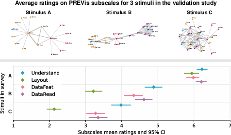
There are four ratings scales : Understand, Layout, DataFeat and DataRead. For each subscale the plot shows the point estimate and 95% Confidence Interval of participants ratings on visualizations A, B, and C. For each scale, the plot show that A has better ratings than B, which has better ratings than C
Visualization readability is an important issue for researchers in our field, but it is not well-defined in existing literature, and we currently lack validated tools to measure it. We have identified four dimensions of visualization readability from a subjective standpoint, which we refer to as perceived readability, and we created scales to measure these dimensions. We also proposed a conceptual framework that links visualization readability to visualization literacy.
PREVis: Perceived Readability Evaluation for Visualization 8. We developed and validated an instrument to measure the perceived readability in data visualization: PREVis. Researchers and practitioners can easily use this instrument as part of their evaluations to compare the perceived readability of different visual data representations. Our instrument can complement results from controlled experiments on user task performance or provide additional data during in-depth qualitative work such as design iterations when developing a new technique. Although readability is recognized as an essential quality of data visualizations, so far there has not been a unified definition of the construct in the context of visual representations. As a result, researchers often lack guidance for determining how to ask people to rate their perceived readability of a visualization. To address this issue, we engaged in a rigorous process to develop the first validated instrument targeted at the subjective readability of visual data representations. Our final instrument consists of 11 items across 4 dimensions: understandability, layout clarity, readability of data values, and readability of data patterns. We provide the questionnaire as a document with implementation guidelines on osf.io/9cg8j. Beyond this instrument, we contribute a discussion of how researchers have previously assessed visualization readability, and an analysis of the factors underlying perceived readability in visual data representations.
Position paper: A case to study the relationship between data visualization readability and visualization literacy 30. In this position paper we argue that improving visualization literacy evaluation tools is important for defining and understanding the concept of readability in data visualizations. Only with reliable and relevant measures can we assess how a potential factor affects a reader’s performance; accordingly, only with appropriate measuring instruments can we start to investigate the tight web of interactions between individual characteristics, features of the visual design, and reading tasks requirements. As we slowly progress in our understanding of how people process information from data visualization, and based on these improved tools and other developments, we can further develop theoretical foundations in data visualization.
8.2 Visualization for the domain of fitness and sports
Participants: Lijie Yao [Inria Paris-Saclay now Xi'an Jiaotong-Liverpool University, correspondent], Junxiu Tang [Zhejiang University, Inria Paris-Saclay], Petra Isenberg [Inria Paris-Saclay, correspondent], Romain Vuillemot [Ecole Centrale de Lyon], Tanja Blascheck [University of Stuttgart], Ali Sarvghad [University of Massachusettes Amherst], Zack While [University of Massachusettes Amherst].
We have conducted research in two directions.
8.2.1 How to improve visualizations for fitness trackers
This figure shows four small data dashboard displayed on smartwaches. The dashboards vary in they way of representing calories burned, step count and active minutes.
We were specifically interested in understanding how people perceive visualizations on fitness trackers. In a first paper 36, we present results of a replication study on smartwatch visualizations with adults aged 65 and older. Smartwatches pose challenges to this population: fonts and visualizations are often small and meant to be seen at a glance. We replicated a study that investigated how visualization type and number of data points affect glanceable perception. We observe strong evidence of differences for participants aged 75 and older, sparking interesting questions regarding the study of visualization and older adults.
In a second project 33, we assessed how different walking trajectories (straight line, circular, and infinity) and speeds (2 km/h, 4 km/h, and 6 km/h) influence the accuracy and response time of participants reading micro visualizations on a smartwatch. We showed our participants common watch face micro visualizations including date, time, weather information, and four complications showing progress charts of fitness data. Our findings suggest that while walking trajectories did not significantly affect reading performance, overall walking activity, especially at high speeds, hurt reading accuracy and, to some extent, response time.
8.2.2 Embedded visualizations for sports
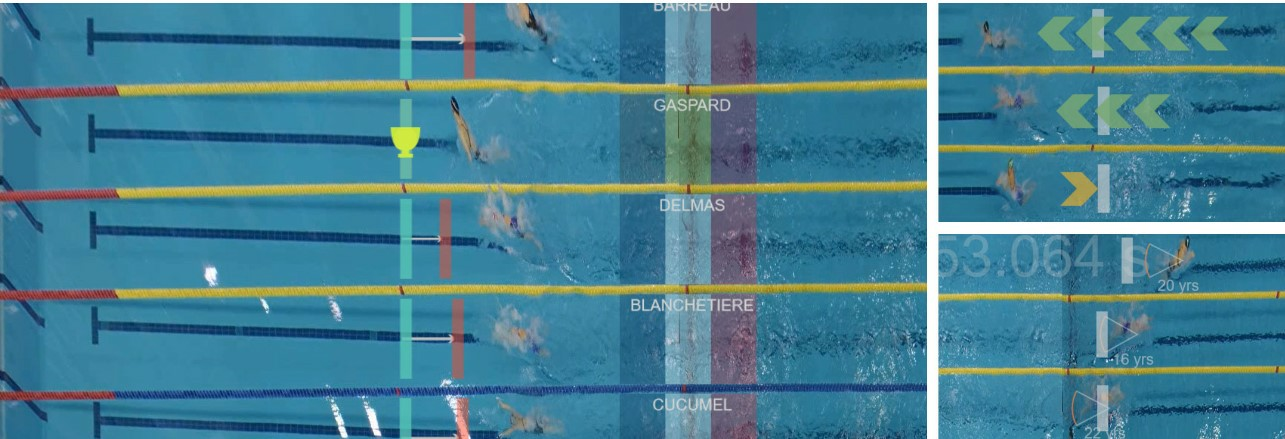
This figure highlights the wide diversity of visualizations that can be live-embedded in swimming videos.
In a second stream of research we investigated how to design visualizations to be embedded into sports videos or AR video streams. We specifically worked on shorter workshops and opinion pieces as first explorations into the topic of first-person visualizations for use during sports activities 32, 34. In addition, we published a full journal paper on our exploration of visualizations for swimming videos 6. Our work makes several contributions in identifying opportunities for visualizations to be added to swimming competition coverage but, most importantly, in identifying requirements and challenges for designing situated visualizations in motion. Our investigations include the analysis of a survey with swimming enthusiasts on their motion-related information needs, an ideation workshop to collect designs and elicit design challenges, the design of a technology probe that allows to create embedded visualizations in motion based on real data, and an evaluation with visualization designers that aimed to understand the benefits of designing directly on videos
8.3 Progressive Data Analysis: Roadmap and Research Agenda
Participants: Jean-Daniel Fekete [Inria, Paris-Saclay, correspondent].
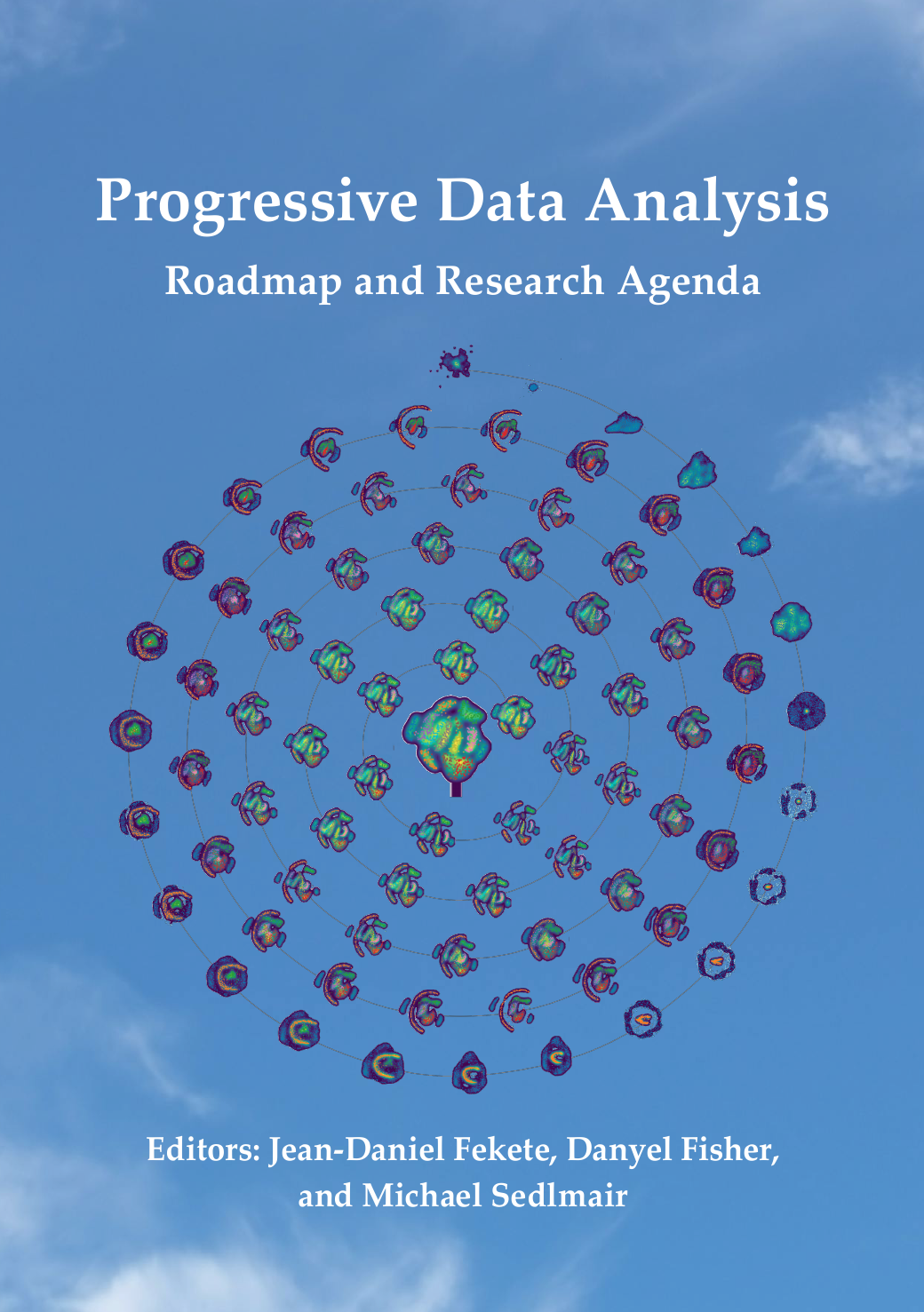
Cover of the book `Progressive Data Analysis'
The book “Progressive Data Analysis: Roadmap and Research Agenda” 2 summarizes the current state of the art of the new research domain called Progressive Visual Analytics or Progressive Data Analysis. It has been written by 20 researchers in a few years and provides a summary of the research landscape in this new challenging domain, as well as a roadmap to tackle these challenges. See also the Book's web site.
9 Bilateral contracts and grants with industry
9.1 Bilateral contracts with industry
Participants: Jean-Daniel Fekete, Katerina Batziakoudi.
CIFRE PhD fellowship of Katerina Batziakoudi with the Company Berger-Levrault (2023–2026).
Participants: Petra Isenberg, Florent Cabric.
Contract with PayAnalytics for joint work on the Inria exploratory action called “Equity Analytics” (2022-2024)
10 Partnerships and cooperations
10.1 International research visitors
10.1.1 Visits of international scientists
Other international visits to the team
Narges Mayhar
-
Status:
Researcher
-
Institution of origin:
University of Massachusetts Amherst
-
Country:
USA
-
Dates:
November 2024 – June 2025
-
Context of the visit:
Sabbatical
-
Mobility program/type of mobility:
sabbatical
Emanuele Marques Rodrigues Santos
-
Status:
Researcher
-
Institution of origin:
Universidade Federal do Ceará
-
Country:
Brazil
-
Dates:
January 2024 – February 2025
-
Context of the visit:
Sabbatical
-
Mobility program/type of mobility:
sabbatical
Tobias Rau
-
Status:
PhD student
-
Institution of origin:
University of Stuttgart
-
Country:
Germany
-
Dates:
September 2024 – December 2024
-
Context of the visit:
collaboration on immersive interaction with 3D data
-
Mobility program/type of mobility:
funded by Univ. Stuttgart
Filip Opálený
-
Status:
PhD student
-
Institution of origin:
Masaryk University
-
Country:
Czech Republic
-
Dates:
November 2024 – December 2024
-
Context of the visit:
collaboration on the visualization of chromatin data
-
Mobility program/type of mobility:
funded by Mazaryk Univ.
Junxiu Tang
-
Status:
PhD student
-
Institution of origin:
Zhejiang University
-
Country:
China
-
Dates:
September 2023 – June 2024
-
Context of the visit:
Work on visualization for sports video
-
Mobility program/type of mobility:
CSC internship program
Karelia Alexandra Vilca Salinas
-
Status:
PhD student
-
Institution of origin:
University of São Paulo (USP)
-
Country:
Brazil
-
Dates:
March 2023 – January 2024
-
Context of the visit:
PhD internship
-
Mobility program/type of mobility:
Brazilian “Sandwhich” PhD funding
Lu Ying
-
Status:
PhD Student
-
Institution of origin:
Zhejiang University
- Country: China
-
Dates:
January 2024 – September 2024
-
Context of the visit:
PhD internship
-
Mobility program/type of mobility:
China Scholarship Council (CSC)
Eliane Zambon Victorelli
-
Status:
PostDoc
-
Institution of origin:
University of São Paulo
-
Country:
Brazil
-
Dates:
May 2024 – July 2024
-
Context of the visit:
Joint research project on the development of a new research instrument for the evaluation of user experience with visual analytics systems.
-
Mobility program/type of mobility:
Research Internship Abroad funded by FAPESP
10.2 National initiatives
-
Program:
ANR PRC (ANR-19-CE33-0012)
-
Project acronym:
EMBER
-
Project title:
Situated Visualizations for Personal Analytics
-
Duration:
2020 – 2025. Total funding: 712 k€
-
Coordinator:
Pierre Dragicevic
-
Other partners:
Inria Bordeaux, Sorbonne Université
-
Participants in AVIZ:
Participants: Petra Isenberg.
-
Abstract:
The Ember project studies how situated data visualization systems can help people use their personal data (e.g., fitness and physiological data, energy consumption, banking transactions, online social activity,…) for their own benefit. Although personal data is generated in many areas of daily life, it remains underused by individuals. Rarely is personal data subjected to an in-depth analysis and used to inform daily decisions. This research aims to empower individuals to improve their lives by helping them become advanced consumers of their own data. This research builds on the area of personal visual analytics, which focuses on giving the general public effective and accessible tools to get insights from their own data. Personal visual analytics is a nascent area of research, but has so far focused on scenarios where the data visualization is far removed from the source of the data it refers to. The goal of this project is to address the limitations of traditional platforms of personal data analytics by exploring the potential of situated data visualizations. In a situated data visualization, the data is directly visualized near the physical space, object, or person it refers to. Situated data visualizations have many potential benefits: they can surface information in the physical environment and allow viewers to interpret data in-context; they can be tailored to highlight spatial connections between data and the physical environment, making it easier to make decisions and act on the physical world in response to the insights gained; and they can embed data into physical environments so that it remains visible over time, making it easier to monitor changes, observe patterns over time and collaborate with other people. Website: ember.inria.fr/.
10.3 Other projects:
ParcoursVis
-
Program:
Post-doctoral funding
-
Project acronym:
ParcoursVis
-
Project title:
ParcoursVis: Visualization of Patient Pathways
-
Duration:
2022 – 2025.
-
Coordinator:
Jean-Daniel Fekete
-
Participants in AVIZ:
Participants: Jean-Daniel Fekete, Mickaël Sereno, Sungbok Shin.
-
Other partners:
Health-Data-Hub
-
Abstract:
The Aviz Team and the Health-Data-Hub (French Social Security) are interested in evaluating patient pathways for treatments. We are currently working on two main projects: (1) ParcoursVis and (2) ParcoursUrge. In ParcoursVis, doctors want to understand the differences between how treatments are de facto given around France and how they align with the official recommendations. In ParcoursUrge, we visualize the events that take place in the Emergency services of the Parisian hospitals to help doctors and hospitals optimize patient management. Both ParcoursVis and ParcoursUrge projects present several challenges, such as finding methodologies to effectively process large-scale data (multi-million patients with hundreds or thousands of events per patient). They transform raw data collected for prescription reimbursement or monitoring into an effective visualization. To visualize and interact with this high volume of data, we rely on Progressive Data Analysis. We visualize millions of patient events by aggregating them on the fly by "chunks", groups of 10,000 or so patients, iteratively. At each iteration, we update the visualization that quickly converges to the final result. This method allows aggregating and visualizing billions of patients with no noticeable delays, allowing smooth interactions at any time. We apply it to improve health at the country or regional level, a scale that was impossible to handle before.
URGE
-
Program:
Inria-AP-HP Funding
-
Project acronym:
URGE
-
Project title:
URGE: Analysing and optimizing emergency patient pathways
-
Duration:
2022 – 2026.
-
Coordinator:
Xavier Leroy (Inria) and Youri Yordanov (AP-HP, Inserm, Sorbonne Université)
-
Participants in AVIZ:
Participants: Jean-Daniel Fekete, Mickaël Sereno, Ambre Assor.
-
Other partners:
Hôpital Saint Antoine, Sorbonne Université
-
Abstract:
For more than 15 years, emergency departments have been facing a steady increase in their number of patients, leading to long periods of crowding, defined as the moments when health care demand exceeds the department's capacity to provide quality care within a reasonable time. The URGE project aims at developing mathematical analysis and numerical simulation tools for flows analysis of the emergency departments. Our objectives are to assess the performances of different organizations, to evaluate the impact of their evolutions and optimizations, starting from the triage step and until the end of the patient journey, in a risk-free environment. This project brings together teams from the AP-HP emergency departments, the Tropical team (Inria Saclay - CMAP, École polytechnique), the Aviz team (Inria Saclay - Université Paris-Saclay), the Dyogene team (Inria Paris - ENS), the "Observatoire des soins non programmés d'île de France" and the "plateforme de recherche Est Parisien" (AP-HP).
EquityAnalytics
-
Program:
Inria AeX
-
Project acronym:
EquityAnalytics
-
Project title:
EquityAnalytics
-
Duration:
2022 – 2024.
-
Coordinator:
Petra Isenberg
-
Participants in AVIZ:
Participants: Petra Isenberg, Florent Cabric.
-
Other partners:
PayAnalytics
-
Abstract:
The goal of this project is to explore, develop, and test pay equity visual analytics solutions in order to give decision makers the power to eradicate adjusted gender pay gaps. We will develop new visual analytics solutions that summarize pay structures in a manner that clearly shows the changes that should be made in order for the pay structure to be fair and rational and that allows managers to evaluate recommended action plans, make informed decisions and monitor progress using a visual interactive user interface. We will collaborate with a startup company called PayAnalytics that provides access to real data and use cases.
11 Dissemination
11.1 Promoting scientific activities
11.1.1 Scientific events: organisation
Member of the organizing committees
- Florent Cabric: Alt.IHM Chair for IHM’24 conference
- Petra Isenberg: Young Researcher Award Committee for EuroVis
- Tobias Isenberg: tutorials and panels co-chair for EuroVis 2024, best posters committee member for CGVC 2024
Service
- Anne-Flore Cabouat: student volunteer for VIS 2024
11.1.2 Scientific events: selection
Chair of conference program committees
-
Jean-Daniel Fekete: HILDA Workshop Co-Chair
Co-organizer of the EuroVA session on Progressive Data Analysis at EuroVA 2024, Odense, DK, May 27th
IEEE VIS Workshop on Progressive Data Analysis and Visualization, with Alex Ulmer, Jaemin Jo, and Michael Sedlmair, St. Pete Beach, Florida, Oct. 14
Member of the conference program committees
- Jean-Daniel Fekete: Undone Computer Science, IEEE VIS 2024, EDBT/ICDT International Workshop on Big Data Visual Exploration and Analytics
- Petra Isenberg: CHI 2024
- Tobias Isenberg: BELIV 2024, VCBM 2024 full papers, VCBM 2024 short papers, IEEE VIS 2024 short papers, EuroVis 2024 full papers, EuroVis 2024 short papers, EuroVis 2024 education papers
Reviewer
- Jean-Daniel Fekete: EuroVis 2024
- Florent Cabric: ACM CHI, IEEE VR
- Petra Isenberg: BELIV 2024, IEEE ISMAR 2024, IEEE VIS 2024, IEEE VIS short papers 2024
- Tobias Isenberg: BELIV 2024, EuroVis 2024 full papers, EuroVis 2024 short papers, EuroVis 2024 education papers, ACM CHI 2024, ISMAR 2024, VCBM 2024, IEEE VIS 2024 full papers, IEEE VIS 2024 short papers
11.1.3 Journal
Member of the editorial boards
- Jean-Daniel Fekete: IEEE TVCG, Member of the Scientific Committee of the French journal “Humanités Numériques”
- Jean-Daniel Fekete: Associate Editor-in-Chief IEEE Transactions on Visualization and Computer Graphics
- Petra Isenberg: Associate Editor-in-Chief IEEE Computer Graphics and Applications (CG&A), Associate Editor for Computer Graphics Forum
- Tobias Isenberg: Associate Editor for Elsevier Computers & Graphics, Associate Editor for Computer Graphics Forum
Reviewer - reviewing activities
- Jean-Daniel Fekete: IEEE Transaction on Visualization and Computer Graphics, EG Computer Graphics Forum
- Florent Cabric: IEEE Transaction on Visualization and Computer Graphics
- Petra Isenberg: IEEE Transaction on Visualization and Computer Graphics, EG Computer Graphics Forum, Interacting with Computers
- Tobias Isenberg: IEEE Transaction on Visualization and Computer Graphics, International Journal of Human - Computer Studies
11.1.4 Invited talks
- Jean-Daniel Fekete
- Improving IPCC Data Visualization with Traceability, Keynote for the 2024 Pernambuco Seminar on visualization and sustainability, Recife, Brazil, Oct. 21, 2024
- Presentation of the book on Progressive Data Analysis at the EuroVA session on Progressive Data Analysis at EuroVA 2024, Odense, DK, May 27th, 2024
- Scalability in Visualization and Visual Analytics with Progressive Data Analysis, Keynote for AVI 2024, Arenzano (Genoa), Italy, Jun. 5, 2024
- Visualisation de données : quelques avancées récentes, Keynote for the Chimiométrie 2024 conference, Nantes, Feb. 27, 2024
- Petra Isenberg
- Bringing Data to Life: Embedded Visualizations for Pervasive and Mobile Data Exploration. Keynote at CGVC 2024
- Visualization for Mobile Devices and Embedded Experiences, Seminar University of Bremen, Germany
- Tobias Isenberg
- Visualization of Species Distributions based on Social Media Data and a Couple of Surprises and Insights. Keynote at VCBM (September 2024)
- Thoughts on how to Effectively Explore Visual Representations in Mixed Reality, University of Stuttgart, Germany (April 2024)
11.1.5 Leadership within the scientific community
- Jean-Daniel Fekete: Co-Chair of the IEEE VIS Area Curation Committee
- Petra Isenberg: member of the steering committee of the BELIV Workshop on Evaluation and Beyond—Methological Approaches for Visualization, vice-chair of the IEEE VIS steering committee
- Tobias Isenberg: member of the steering committee of the BELIV Workshop on Evaluation and Beyond—Methological Approaches for Visualization
- Florent Cabric (vice-chair) and Petra Isenberg (treasurer): members of ACM SIGCHI Paris Local Chapter.
- Florent Cabric: co-chair of joint Groupe Travail (GT) VISU for the Groupements De Recherche (GdR) Informatique Géométrique et graphique, la Réalité virtuelle et la Visualisation (IG-RV) and Interaction Humain-Machine (IHM).
11.1.6 Scientific expertise
- Petra Isenberg: reviewer for multiple grant organizations (FWF, FWO, NSERC, Mitacs), hiring committees, promotion committees, and the Graphics Replicability Stamp committee
- Tobias Isenberg: member of ANR grant evaluation committee “Interaction Robotique” (CE33) for ANR’s AAPG 2024; reviewer for grant application (FWF)
11.2 Teaching - Supervision - Juries
11.2.1 Teaching
- Master: Jean-Daniel Fekete , Visual Data Analysis at the Parisian Master of Research in Computer Science with Julien Tierny. 25 hours. Joint Master with Univ. Paris-Cité, ENS Ulm, Univ. Paris-Saclay, Institut Polytechnique de Paris.
- Crash course: Jean-Daniel Fekete , on HCI and Visualization, 6h, to IRT SystemX
- Master: Petra Isenberg, Katerina Batziakoudi, “Interactive Information Visualization”, 36.5h equivalent TD (total, co-taught with Anastasia Bezerianos), M1/M2, Université Paris-Saclay, France.
- Master: Petra Isenberg , “Visual Analytics”, 60h equivalent TD (co-taught with Natkamon Tovanich), M2, Centrale Supelec.
- Licence: Tobias Isenberg , “Introduction to Computer Graphics”, 18h en équivalent TD, L3, Polytech Paris-Saclay, France.
- Master: Tobias Isenberg , Tingying He , “Data Visualization”, 36h en équivalent TD, M2, CentraleSupélec, France.
- Master: Frédéric Vernier , class and lab class. “Information visualization”, 24h en équivalent TD, M2 ISC, Faculté des sciences d'Orsay. Université Paris-Saclay, France.
- Master: Frédéric Vernier , class and lab class. “Web development with node.js”, 21h en équivalent TD, M2 HCI, Faculté des sciences d'Orsay. Université Paris-Saclay, France.
- Licence: Frédéric Vernier , class and lab class. “Introduction to Computer Graphics”, 42h en équivalent TD, L1-MI, Faculté des sciences d'Orsay. Université Paris-Saclay, France.
- Licence: Frédéric Vernier , class and lab class. “Advanced Computer Graphics”, 36h en équivalent TD, L2-MI, Faculté des sciences d'Orsay. Université Paris-Saclay, France.
- Licence: Frédéric Vernier , class and lab class. “Web development”, 42h en équivalent TD, L3 computer sciences, Faculté des sciences d'Orsay. Univ. Paris-Saclay, France.
- BUT Informatique: Florent Cabric , class and lab class. “Analyse,’’ 22.5 heures en équivalent TD, 2nd year of BUT, IUT d’Orsay. Université Paris-Saclay, France.
- BUT Informatique: Florent Cabric , lab class. “Introduction aux bases de données et SQL,’’ 39 heures en équivalent TD, 1st year of BUT, IUT d’Orsay. Université Paris-Saclay, France.
- BUT Informatique: Florent Cabric , project supervision. “Création d'une base de données,’’ 10 heures en équivalent TD, 1st year of BUT, IUT d’Orsay. Université Paris-Saclay, France.
11.2.2 Supervision
- PhD in progress: Katerina Batziakoudi, Visualization of budget and accounting data, supervised by Jean-Daniel Fekete .
- PhD in progress: Anne-Flore Cabouat , Readability of Visualizations, Univ. Paris-Saclay, supervised by Petra Isenberg.
- PhD in progress: Lixiang Zhao, Interaction Techniques for Spatial 3D data in VR and Mixed Reality, Xi’an Jiaotong-Liverpool Univ. (China), co-supervised by Tobias Isenberg .
- PhD in progress: Yucheng Lu, Hybrid Scientific Data Exploration, Univ. Paris-Saclay, defense planned for December 2026, co-supervised by Tobias Isenberg .
- PhD in progress and visiting PhD student: Tobias Rau , Interactive AR/VR Visualization of Molecular Simulation Data, Univ. Stuttgart (Germany), co-supervised by Tobias Isenberg .
- PhD in progress: Deng Luo, Abstraction of Visual Representations for DNA Nanotechnology and Protein Data, KAUST (Saudi-Arabia), co-supervised by Tobias Isenberg .
- PhD completed: Tingying He , A Design Space for Visual Data Mapping for Low-Color Displays, Univ. Paris-Saclay, defended September 2024, co-supervised by Tobias Isenberg .
- Post-doctoral fellow: Ambre Assor , Emergency department patients pathways and care optimization, supervised by Jean-Daniel Fekete .
- Post-doctoral fellow: Sungbok Shin , Progressive Visualization of Patient Pathways at Scale, supervised by Jean-Daniel Fekete .
- Post-doctoral fellow: Florent Cabric , Gender data visualization for reducing gender pay gap, supervised by Petra Isenberg .
- Masters completed: Anne-Flore Cabouat , A Validated Scale for Measuring the Readability of Visualizations, Univ. Paris Cité, supervised by Tobias Isenberg and Petra Isenberg .
- Masters completed: Zihan Lu , A Design Space of Semantically-Resonant Patterns, Univ. Paris-Saclay, supervised by Tobias Isenberg and Tingying He .
- Visiting PhD Student: Karelia Alexandra Vilca Salinas , Visual analytics for crime analysis, co-supervised by Jean-Daniel Fekete .
- Visiting PhD Student: Lu Ying , Improve the public understanding of the information gathered by IPCC, co-supervised by Jean-Daniel Fekete .
- Visiting PhD Student: Filip Opálený , Interaction with Chromatin Data Representations, co-supervised by Tobias Isenberg .
11.2.3 Juries
- Jean-Daniel Fekete: Alex Ulmer, PhD , “Progressive Visual Analytics for Temporal Data”, Technische Universität Darmstadt, Nov. 19, 2024
- Petra Isenberg: PhD thesis examiner, Alexandre Battut, Université Paris-Saclay, jury president
- Petra Isenberg: PhD thesis reporter, Bradley Rey, University of British Columbia
- Petra Isenberg: HDR committee member, Dr. Benjamin Bach, University of Bordeaux/Inria
- Petra Isenberg: member of comité de suivi for Alan Gany, Université Paris-Saclay
- Petra Isenberg: member of comité de suivi for Yasaman Marandi, Université Paris-Saclay
- Petra Isenberg: member of comité de suivi for Anna Offenwanger, Université Paris-Saclay
- Tobias Isenberg: member of PhD jury for Charlotte Godard, Université PSL/École Normale Supérieure, France
- Tobias Isenberg: president of HdR jury for Dr. Mohamed El Beheiry, Institut Pasteur, France
- Tobias Isenberg: member of comité de suivi for Vincent Bonczak, Université Paris-Saclay
12 Scientific production
12.1 Major publications
- 1 articleEleven Years of Gender Data Visualization: A Step Towards More Inclusive Gender Representation.IEEE Transactions on Visualization and Computer Graphics301January 2024, 316-326HALDOIback to text
- 2 bookJ.-D.Jean-Daniel Fekete, D.Danyel Fisher and M.Michael Sedlmair, eds. Progressive Data Analysis: Roadmap and Research Agenda.EurographicsNovember 2024, 231HALDOIback to textback to textback to textback to textback to text
- 3 articleDesign Characterization for Black-and-White Textures in Visualization.IEEE Transactions on Visualization and Computer Graphics301January 2024, 1019--1029HALDOIback to textback to text
- 4 articleA Survey of Designs for Combined 2D+3D Visual Representations.IEEE Transactions on Visualization and Computer Graphics306June 2024, 2888–2902HALDOIback to textback to text
- 5 articleScalability in Visualization.IEEE Transactions on Visualization and Computer GraphicsDecember 2022HALDOIback to text
- 6 articleDesigning for Visualization in Motion: Embedding Visualizations in Swimming Videos.IEEE Transactions on Visualization and Computer Graphics303March 2024, 1821-1836HALDOIback to textback to text
12.2 Publications of the year
International journals
International peer-reviewed conferences
Scientific books
Scientific book chapters
Edition (books, proceedings, special issue of a journal)
Reports & preprints
Other scientific publications
12.3 Cited publications
- 50 inproceedingsKnowing when You'Re Wrong: Building Fast and Reliable Approximate Query Processing Systems.Proceedings of the 2014 ACM SIGMOD International Conference on Management of DataSIGMOD '14New York, NY, USASnowbird, Utah, USAACM2014, 481--492URL: http://doi.acm.org/10.1145/2588555.2593667DOIback to text
- 51 articleSteering the Craft: UI Elements and Visualizations for Supporting Progressive Visual Analytics.Computer Graphics Forum363June 2017, 491--502HALDOIback to text
- 52 articleGeneaQuilts: A System for Exploring Large Genealogies.IEEE Transactions on Visualization and Computer Graphics166October 2010, 1073-1081HALDOIback to text
- 53 articleCartolabe: A Web-Based Scalable Visualization of Large Document Collections.IEEE Computer Graphics and Applications412April 2021, 76--88HALDOIback to textback to text
- 54 bookS. K.Stuart K. Card, J. D.Jock D. Mackinlay and B.Ben Shneiderman, eds. Readings in information visualization: using vision to think.San Francisco, CA, USAMorgan Kaufmann Publishers Inc.1999back to text
- 55 articleProgressive Data Analysis and Visualization (Dagstuhl Seminar 18411).Dagstuhl Reports8102018, 1--32URL: https://doi.org/10.4231/DagRep.8.1.1DOIback to text
- 56 unpublishedProgressive Analytics: A Computation Paradigm for Exploratory Data Analysis.July 2016, https://arxiv.org/abs/1607.05162 - working paper or preprintHALback to text
- 57 bookData stream management: processing high-speed data streams.Springer2016back to text
- 58 inproceedingsA Comparison of the Readability of Graphs Using Node-Link and Matrix-Based Representations.InfoVis'04 - 10th IEEE Symposium on Information VisualizationAustin, United StatesOctober 2004, 17-24HALDOIback to text
- 59 bookHandbook of sequential analysis.CRC Press1991back to text
- 60 articlevispubdata.org: A Metadata Collection about IEEE Visualization (VIS) Publications.IEEE Transactions on Visualization and Computer Graphics239September 2017, 2199--2206HALDOIback to text
- 61 phdthesisPhysical and Tangible Information Visualization.Université Paris Sud-Paris XI2014back to text
- 62 articlePANENE: A Progressive Algorithm for Indexing and Querying Approximate k-Nearest Neighbors.IEEE Transactions on Visualization and Computer Graphics262February 2020, 1347-1360HALDOIback to text
- 63 articleA Declarative Rendering Model for Multiclass Density Maps.IEEE Transactions on Visualization and Computer Graphics251January 2019, 470-480HALDOIback to text
- 64 miscSciPy: Open source scientific tools for Python.[Online; accessed <today>]2001, URL: http://www.scipy.org/back to text
- 65 bookThinking, Fast and Slow.Farrar, Straus and Giroux2011back to text
- 66 articleVIS Author Profiles: Interactive Descriptions of Publication Records Combining Text and Visualization.IEEE Transactions on Visualization and Computer Graphics251January 2019, 152-161DOIback to text
- 67 bookMobile Data Visualization.0Chapman and Hall/CRCDecember 2021, 346HALDOIback to text
- 68 articleDimSUM: Dimension and Scale Unifying Maps for Visual Abstraction of DNA Origami Structures.Computer Graphics Forum373June 2018, 403-413HALDOIback to text
- 69 articleMultiscale Visualization and Scale-Adaptive Modification of DNA Nanostructures.IEEE Transactions on Visualization and Computer Graphics241January 2018, 1014--1024HALDOIback to text
- 70 articleMultiscale Molecular Visualization.Journal of Molecular Biology4316March 2019, 1049--1070HALDOIback to text
- 71 inproceedingsResponse Time in Man-computer Conversational Transactions.Proc. of the Fall Joint Computer Conference, Part ISan Francisco, CaliforniaACM1968, 267--277URL: http://doi.acm.org/10.1145/1476589.1476628DOIback to textback to text
- 72 articleStudying Early Decision Making with Progressive Bar Charts.IEEE Transactions on Visualization and Computer Graphics291January 2023, 407-417HALDOIback to text
- 73 articleIntegrating Prior Knowledge in Mixed Initiative Social Network Clustering.IEEE Transactions on Visualization and Computer Graphics272February 2021, 1775 - 1785HALDOIback to textback to textback to text
- 74 miscA Design Space for Linked 2D and 3D Visual Representations.PosterOctober 2022HALback to text
- 75 inproceedingsUnderstanding the Use of The Vistorian: Complementing Logs with Context Mini-Questionnaires.Visualization for the Digital HumanitiesPhoenix, United StatesOctober 2017HALback to text
- 76 articleResponse Time and Display Rate in Human Performance with Computers.ACM Comput. Surv.163September 1984, 265--285URL: http://doi.acm.org/10.1145/2514.2517DOIback to text
- 77 bookInformation Visualization.Boston, MA, USAAddison-Wesley Publishing Company2000back to text
- 78 miscTableau Software.Last accessed Feb 20182018, URL: http://www.tableau.comback to text
- 79 manualR: A Language and Environment for Statistical Computing.R Foundation for Statistical ComputingVienna, Austria2019, URL: https://www.R-project.orgback to text
- 80 articleProgressive Data Science: Potential and Challenges.CoRRabs/1812.080322018, URL: http://arxiv.org/abs/1812.08032back to text
- 81 articleAnalyzing Dynamic Hypergraphs with Parallel Aggregated Ordered Hypergraph Visualization.IEEE Transactions on Visualization and Computer Graphics271January 2021, 1-13HALDOIback to textback to textback to text
- 82 incollectionVisual Abstraction.Foundations of Data VisualizationSpringer International PublishingAugust 2020, 15--37HALDOIback to text
- 83 articlePondering the Concept of Abstraction in (Illustrative) Visualization.IEEE Transactions on Visualization and Computer Graphics249September 2018, 2573--2588HALDOIback to text
- 84 inproceedingsA Vision of Bringing Immersive Visualization to Scientific Workflows.Proceedings of the Conference on Human Factors in Computing Systems (CHI) - Workshop on Interaction Design & Prototyping for Immersive AnalyticsGlasgow, United KingdomMay 2019HALback to text
- 85 bookInformation Visualization -- Perception for Design.Morgan Kaufmann Series in Interactive TechnologiesSan Francisco, CA, USAMorgan Kaufmann Publishers2000back to textback to text
- 86 articleEmbedded Data Representations.IEEE Transactions on Visualization and Computer Graphics2017, 461 - 470HALDOIback to text
- 87 articleVisualization in Motion: A Research Agenda and Two Evaluations.IEEE Transactions on Visualization and Computer Graphics2810October 2022, 3546-3562HALDOIback to text
- 88 articleEfficient Structure-Aware Selection Techniques for 3D Point Cloud Visualizations with 2DOF Input.IEEE Transactions on Visualization and Computer Graphics18122012, 2245-2254HALDOIback to text
- 89 articleIllustrative Molecular Visualization with Continuous Abstraction.Computer Graphics Forum303May 2011, 683--690URL: https://tobias.isenberg.cc/VideosAndDemos/Zwan2011IMVDOIback to text