


Section: New Results
Interaction Techniques
Participants : Caroline Appert, Michel Beaudouin-Lafon [correspondant] , David Bonnet, Anastasia Bezerianos, Olivier Chapuis, Guillaume Faure, Emilien Ghomi, Stéphane Huot, Mathieu Nancel, Wendy Mackay, Cyprien Pindat, Emmanuel Pietriga, Theophanis Tsandilas, Julie Wagner.
Acquiring a target, such as pointing to an icon, a button or a landmark on a digital map, is the most common action in today's graphical user interfaces. We have continued our work to better understand this seemingly simple action and make it faster and more reliable. This year we have conducted theoretical work on small target [12] and more practical work with TorusDesktop [4] .
Targets of only a few pixels are notoriously difficult to acquire. Despite many attempts at facilitating pointing, the reasons for this difficulty are poorly understood. We confirm a strong departure from Fitts' Law for small target acquisition using a mouse and investigate three potential sources of problems: motor accuracy, legibility, and quantization. We find that quantization is not a problem, but both motor and visual sizes are limiting factors. This suggests that small targets should be magnified in both motor and visual space to facilitate pointing. Since performance degrades exponentially as targets get very small, we further advocate the exploration of uniform, target-agnostic magnification strategies. We also confirm Welford's 1969 proposal that motor inaccuracy can be modeled by subtracting a “tremor constant” from target size. We argue for the adoption of this model, rather than Fitts' law, when reflecting on small target acquisition.
With TorusDesktop [4] , we revisited a pointing technique that allows to wrap the mouse cursor around screen edges in conventional desktop environments. Allowing the cursor to jump from one edge of the screen to the opposite one (i.e., turning the desktop into a torus) was already explored, but never studied empirically nor designed for everyday desktop usage. We have introduced a dead zone and an off-screen cursor feedback that ease the use of this technique. We also conducted three controlled experiments to refine the design and evaluate its performance. Our results suggest clear benefits in several conditions, but also some potential limitations due to users' over-estimation of cursor wrapping advantages. An implementation of TorusDesktop for the Mac OS X desktop can be downloaded for free at http://insitu.lri.fr/TorusDesktop .
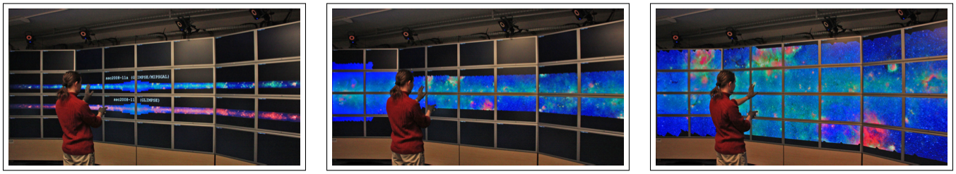
We continued our work on wall-sized displays, focusing on the study of high-level tasks such as pan-zoom navigation (Figure 10 ), that have received little attention. Indeed, while pointing on this type of display has been studied extensively, it remains unclear which techniques are best suited to perform multiscale navigation in these environments. Building upon empirical data gathered from studies of pan-and-zoom on desktop computers and studies of remote pointing, we identified three key factors for the design of mid-air pan-and-zoom techniques: uni- vs. bimanual interaction, linear vs. circular movements, and level of guidance to accomplish the gestures in mid-air. After an extensive phase of iterative design and pilot testing, we ran a controlled experiment aimed at better understanding the influence of these factors on task performance. This work received a best paper award at CHI 2011 [6] .
|
On the opposite side, we have studied small displays such as the ones smartphones are equipped with. One major challenge with this type of device is to make the user able to interact in parallel with both the device and other artefacts in his environment (e.g., giving a phone call while holding a paper document). The Swiss Army Menu (SAM) [27] is a radial menu that enables a very large number of functions accessible via small thumb movements. The design of SAM relies on four different kinds of items, support for navigating in hierarchies of items and a control that requires only the thumb of the hand that holds the device. SAM can offer a set of functions so large that it would typically have required a number of widgets that could not have been displayed in a single viewport at the same time.
The different interaction techniques presented above are aimed at improving the control within a given representation. As a complement, we have also worked on improving the user's experience by providing him with two (or more) representations of the data he is interacting with and ways to transition between these representations.
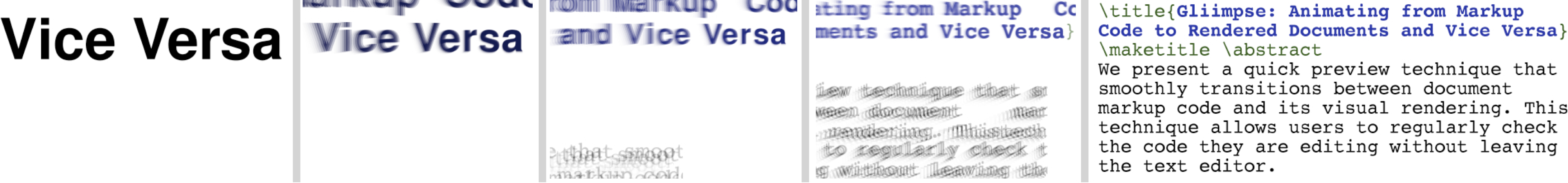
Gliimpse [17] is a quick preview technique that smoothly transitions between document markup code (HTML, wiki markup or LaTeX) and its visual rendering (see Figure 11 ). It allows users to regularly check the code they are editing in-place, without leaving the text editor. Gliimpse can complement classical preview windows by offering rapid overviews of code-to-document mappings and leaving more screen real-estate. As the technique smoothly show the links between the code and the rendered result, it can also help to learn how complex markup code will result in the final document (e.g., HTML tables or LaTeXformulae).
In collaboration with University of Toronto and OCAD University, we designed a novel visualization technique called ChronoLenses [14] , aimed at supporting users in time-series visual exploration tasks. ChronoLenses perform on-the-fly transformation of the data points in their focus area, tightly integrating visual analysis with user actions, and enabling the progressive construction of advanced visual analysis pipelines, supporting tasks that require visualizing derived values, identifying correlations, or discovering anomalies beyond obvious outliers.
We further explored user understanding of data presented in Dual-Scale data charts, charts that incorporate two different data resolutions into one chart in order to emphasize data in regions of interest (focus) or to enable the comparison of data from distant regions (context) [13] . In collaboration with researchers from inria AVIZ, we presented a unified description of different Dual-Scale data charts, and we compared them in terms of user understanding using elementary graphical perception tasks, such as comparing lengths and distances. Our study suggests that cut-out charts which include collocated full context and focus are the best alternative, and that superimposed charts in which focus and context overlap on top of each other should be avoided.